Role: Lead Designer, UX Researcher
Team: 1 Product Designer, 1 PM, 10 devs
The idea for the topology map didn’t start with a formal feature request. It started with a story.
During one of our advisory board calls, a partner described how whenever a client called about a downedWi-Fi network or a misbehaving switch, he would open Datto Network Manager — and a massive Excel spreadsheet on his second monitor. That spreadsheet had every device, its MAC address, IP, model, and a note field labeled “connected to.” It was the only reliable way he could understand what his network looked like in a hurry.
He said it almost jokingly, but it stuck with me:
“Excel is my topology map.”
And he wasn’t alone. Over the next few weeks, I heard variants of the same story from multiple MSPs (Managed Service Providers):
- MSPs keeping device lists and connection info in spreadsheets as makeshift maps
- Techs manually building Visio or draw.io diagrams for network documentation (and updating themby hand)
- Admins clicking through 5–10 device pages just to trace an uplink or find a bottleneck
All of these methods had one thing in common: they were workarounds built on top of absence. There was no unified way to see the network in our software.
If you manage a network, visibility isn’t a luxury — it’s survival. You need to instantly know:
- What’s connected to what? (Topology and physical wiring)
- Where does that AP uplink?
- Is the router on primary WAN or LTE failover?
- Is that port nearing saturation or throwing errors?
- Which subnet/VLAN is a particular device or endpoint on?
- Who's online? Who's offline?
Network Manager already had all of this data – but it lived in tiny separate pockets scattered across different pages. My job was to bring it all together into one coherent view.
I deliberately framed the project not as “build a topology map,” but as a mission statement:
Give admins the ability to instantly understand their network without cobbling together mental models, spreadsheets, and multiple pages.
This vision set the tone for what the solution needed to be:
- Accurate: The map’s data must be trustworthy above all. If it lies or is outdated, admins will abandon it.
- Readable: Even large networks should be easy to navigate and not descend into spaghetti lines. Clarity at a glance was key.
- Informational: Not just nodes and lines – the map should surface status, alerts, and utilization directly on the visualization.
- Actionable: No dead-ends. If you see an issue on the map, you should be able to jump into diagnostics or device actions right from there.
In short, this tool would replace Excel, Visio, and tribal knowledge with something far better.
For the first month, I didn’t sketch a single UI. Instead, I sat down (virtually) with 7 of our advisory board members every week and just listened. As the sole designer, it was my responsibility to gather these insights first-hand. I asked them questions like:
- “Show me how you currently understand your network’s layout.”
- “When something goes wrong, where do you look first?”
- “If you could wave a magic wand, what would this map show you?”
- “What frustrates you about topology maps you’ve used in the past?”
Their answers shaped the foundation of the design. Admins wanted a topology map that would:
- Reflect physical wiring (true cable connections and link order), not just an abstract graph
- Visually distinguish wireless connections vs wired (so an AP mesh link wouldn’t look the same as an Ethernet cable)
- Include the internet edge (modems/routers, WAN links) – not just the LAN devices
- Display failover states (e.g. show when the primary WAN is down and an LTE backup is active)
- Highlight alerts or issues on devices and links (e.g. port down, high utilization, packet loss)
- Reveal VLAN tagging on switch ports and uplinks (to see how traffic is segmented)
- Drill down into endpoint/client associations (which AP a laptop is connected to, which switch port a printer is on)
- Provide search by MAC or hostname, and allow export/print for documentation or audits
One quote from an admin hit especially hard:
“Topology maps are cool until they lie. Then we stop trusting them.”
That drove home the point that accuracy had to be a core design principle, not just a feature checkbox.
UXR sessions
Before diving into design, I studied other network mapping tools — from big names like Ubiquiti and Meraki to specialist tools like Auvik and Domotz. Each had strengths and pitfalls. Some did automatic discovery beautifully; others displayed VLAN info cleanly; and some failed in almost comical ways (UniFi’s map, for example, looked pretty but had such unreliable data that many admins said it was essentially useless).
My takeaway was clear:
Admins would rather have 90% of the network drawn perfectly than 100% drawn poorly.
In other words, it’s better to intentionally not display something (or require a manual confirmation) than to show a “guess” that might be wrong. That principle guided everything that came next.
Competitor Analysis
Before jumping into visuals, I focused on the underlying logic that would make the map reliable. A topology map isn’t just about designing lines — it’s about showing the network as it really is. So instead of opening Figma first, I worked closely with engineering to figure out how we’d gather and display the right data.
We aligned on a few core rules:
- Every line on the map should reflect a real connection, not just a guess.
- Devices should be grouped and displayed based on how they’re actually wired or linked — wired vs wireless, upstream vs downstream.
- If something is offline or failing, it should show up clearly in the visualization.
- Routing & Uplink logic: to infer uplink/downlink relationships between devices (e.g. which switch port leads to an upstream router)
- Failover states: to represent dual WAN routers or backup links (like a cellular failover) accurately
At the same time, I established a clear classification of node types that the UI would depict, each with a distinct icon and role:
- Router/Gateway: The network edge device (often connecting to the ISP)
- Switch: The wired distribution layer
- Access Point (AP): Wireless distribution point
- Managed Power Unit: Power distribution (for peripherals/PoE resets, etc.)
- Endpoint/Client: Laptops, phones, printers, and other client devices on the network
And I defined link styles to visually indicate connection types and status:
- Solid line: A wired Ethernet connection
- Dotted line: A wireless link (e.g. mesh uplink or wireless bridge)
- Bold bundle: A link aggregation (port trunk/LAG) combining multiple physical links
- Red line or icon: An error state on that link (e.g. link down or critical alert on the interface)
This underlying model became the grammar of the map — the rules that ensured the picture on screen was an accurate reflection of reality.
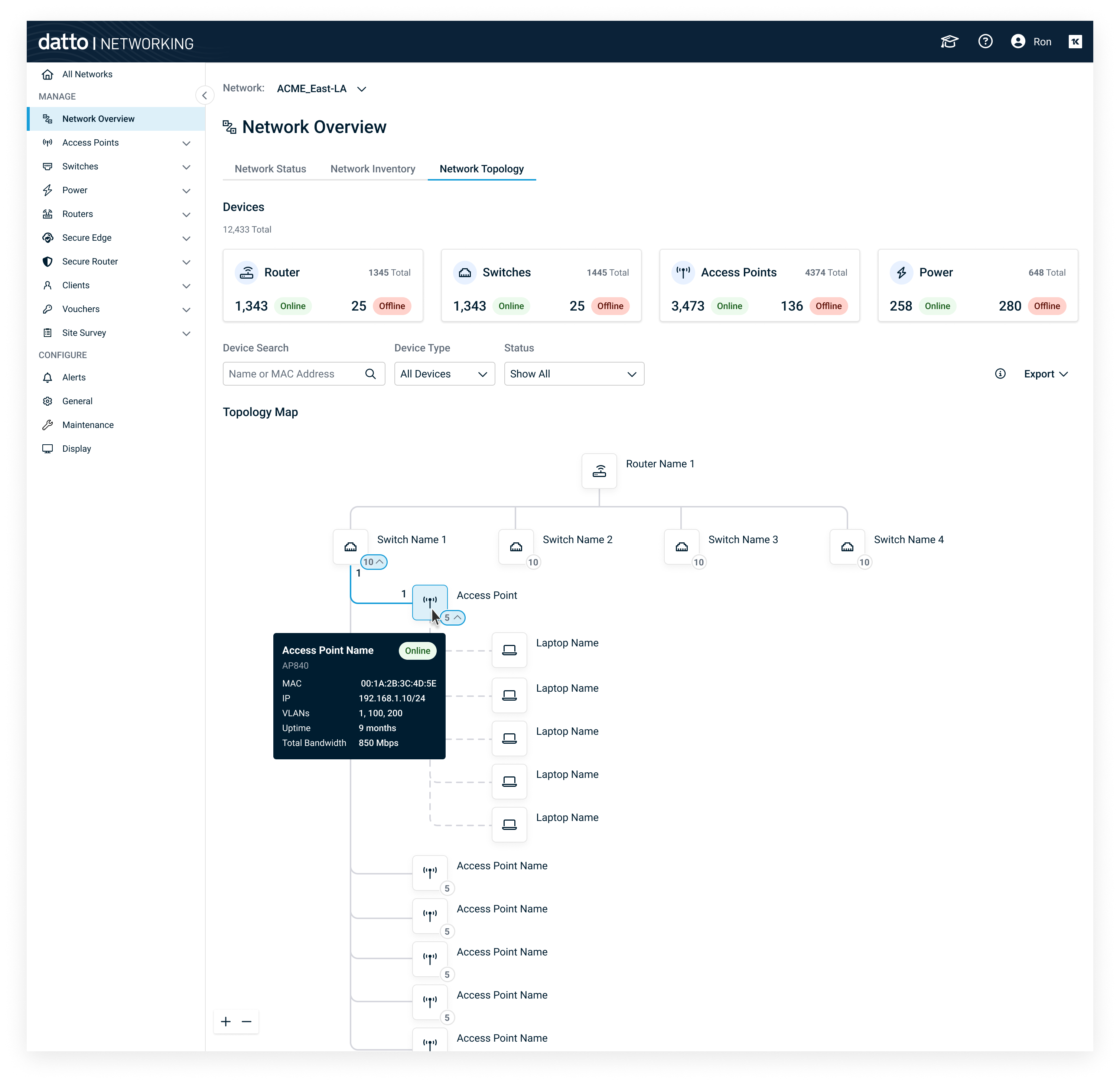
Topology Map Interaction States — Demonstrates how hover and selection states surface critical network information without cluttering the default view. Users can inspect device details, link utilization, VLAN tagging, and loop conditions directly on the map through contextual tooltips.
Unlike some features where linear workflows make sense, topology isn’t a “screen 1 → screen 2 → success” type of problem. It’s a spatial, exploratory tool — people pan, hover, inspect, filter, and take action in whatever order the problem demands.
I focused on designing the core interaction patterns and use cases that needed to feel effortless:
- Searching for a device by MAC or hostname
- Understanding network hierarchy at a glance
- Inspecting a link for port numbers, VLANs, or utilization
- Seeing alerts and degraded devices inline
- Tracing wireless vs wired connections
- Viewing router WAN failover state (primary → LTE)
- Exporting the map for documentation
For each of these, i created focused high-fidelity mockups that showed critical UI states:
- default
- hover
- selected
- alert
- filtered
- export modal
- search result
- collapsed/expanded hierarchy
These screens let me walk partners through scenarios verbally, which worked extremely well for a tool that is inherently exploratory.
Topology Map High-Fidelity Design
With a clear vision and prototype in hand, I worked closely with our engineers over the next 6 months to bring the topology map to life. We iterated through design and development, gradually evolving the map to include a robust set of features and refinements:
- WAN edge awareness: We depict the internet uplink and show whether the router is on primary WAN or has failed over to LTE backup, so you always know your network’s external connectivity status.
- Real-time bandwidth indicators: Little utilization bars on links (bps → Gbps) so you can see if a link is idle or maxed out.
- VLAN visualization: Each link can display tags for VLAN IDs (showing which VLANs are allowed or the untagged VLAN) to help troubleshoot network segmentation issues.
- Device hover cards: Hovering a device node shows a mini card with key info (MAC, IP, uptime, link speed, status, etc.) without leaving the map.
- Link hover details: Hovering a connection line shows port numbers on each end, current bandwidth usage, error rates, and any duplex or PoE info.
- Quick actions on nodes: Right-click (or … menu) on each device for actions like “Reboot device,” “Blink LEDs,” “Toggle PoE port” — empowering admins to react instantly.
- Search and filtering: A universal search to jump to any device by name, IP, or MAC, plus filters to show/hide certain device types or networks (e.g. only show one building’s devices, or just networking equipment vs clients).
- Export options: The ability to export the whole map to Visio (for further editing), or save as an SVG/PNG for documentation and client reports.
Throughout development, I kept user-testing new iterations with our advisory board members, incorporating their feedback on layout, iconography, and performance. We had to tweak the auto-layout algorithm many times to prevent overlapping lines in dense networks and to make sure the map scaled from small sites (5 devices) to huge ones (500+ devices) without becoming unusable.
And then came the most gratifying moment of the project. During a final prototype review, I revisited the partner who inspired this project — the one with the giant Excel sheet. I walked him through the working topology map. He leaned back and said with a smile: “I can finally delete that spreadsheet.”
That was the moment I knew we had built the right thing. A real user was telling us that our design had eliminated a pain that had persisted for years.
.png)
Topology Map design showing how selecting a device opens the drawer to reveal its status and details.
As of now, the topology map feature is in active development with our advisory board members acting as early beta users. I continue to lead design refinements as we gather more feedback in this beta phase.
The impact of this feature is already being felt internally and externally, even before a full public launch. Our support teams plan to use the map during troubleshooting calls to more quickly visualize client networks and pinpoint issues. Our engineering team got so invested in the project that they began extending our device discovery protocols — because now that the data is visible, accuracy matters more than ever. And our product management team is positioning the topology map as a key differentiator in sales demos, since many competitors lack an integrated mapping tool with this level of clarity.
In other words, the topology map hasn’t just added a new screen in the product — it’s changing behaviors.Teams are relying on real data instead of tribal knowledge, and users are starting to expect this kind of visual network insight as a given. That’s exactly the kind of deeper impact I aim for in my work as a designer.
This project taught me a few lasting lessons that I’ll carry into every future project:
- Not all pain points come as feature requests. Sometimes the biggest UX improvements hide in the tools outside the product (like an Excel sheet) that users feel forced to rely on. It’s our job to spot those and solve them.
- Trust beats aesthetics. A beautiful visualization means nothing if it’s inaccurate. In data-heavy tools, accuracy and clarity are the foundations of a great UX. Users must trust what they see.
- Design is systems thinking. Especially for a feature like this, it wasn’t just about drawing pretty lines. It required understanding networking protocols, data schemas, and failure states. The best UX design often happens between the screens — in how the system behind them is orchestrated.
- The best designs narrate themselves. I learned to envision the user story first (like our technician troubleshooting Wi-Fi) and let that narrative dictate the features. If a technician can follow the map like a story — logically from problem to solution — then you know the design is working.
This topology map project is one I’ll remember for a long time. Not because of fancy visuals or clever tech, but because it made someone’s job easier in a tangible way. To me, that’s the ultimate win for user experience design.