Trader Joes is a grocery store that sells directly to customers. Since the rise of grocery delivery services, Trader Joes has fallen behind. They want to offer a delivery/pickup option to grow market share and increase sales.
Role
UX/UI Designer & Researcher
Tools
Sketch Miro InVision
Timeline
2 Weeks
Challenges
Creating an easy and efficient process for buying/ordering groceries directly online
Understanding the target market and how they prefer to buy groceries
Solutions
Redesigning the website making it easy to use and allows customers to browse through products in their preferred location
Designing a feature for customers to purchase/order groceries with a simple checkout process
Design Process
1. Research
The focus of research is to gain a better understanding of what impacts consumer decisions when buying groceries and how they look for products to purchase online.
I started by writing a research plan and listing the goals/questions that should be answered:
1. Who are Trader Joe's competitors? 2. Do users prefer shopping for groceries, online or in store? 3. When grocery shopping, what are user pain points and gains? 4. How often do users grocery shop?
Market Research
I began by doing secondary research about the market and how online groceries have grown with future growth projections. All of Trader Joe's competitors have implemented a pickup/delivery option showing product offerings online. Their target demographic are young professionals (20-30s) that use their phone to buy almost anything. Due to the pandemic, people have had to wait in extremely long lines and have relied heavily on delivery. These insights helped me identify the demographic I would be interviewing and understand who I would be designing for.
Then, I created a competitor analysis to understand what's currently available to customers and gain insights about industry trends. This helped me understand how the competitors label, categorize, and filter products. Since groceries may have hundreds of items, this was key information when creating the sitemap and task flow.
Competitor Analysis
User Research
I started by listing questions that would reveal insights to target users pains and gains. I interviewed 7 participants who fit the target demographic to gain an understanding of the users experience when purchasing groceries. Trader Joe's target demographic values unique, quality, low priced food. Since Trader Joe's doesn't offer a delivery service, I had to find participants who shop for groceries online and at Trader Joe's.
User Persona
Based on research and insights, I created a user persona of Trader Joes' key audience to address the major needs and pain points of the user group.
Since the user gets frustrated waiting in lines at grocery stores, this helped me solidify my hypothesis that Trader Joe's must implement a delivery/pickup option. They also must redesign their website to market their new products and product stories. Trader Joe's young tech savvy demographic finds products online through advertisements. Redesigning their website to advertise their new products and product stories would increase Trader Joe's sales and customer awareness of products.
Here is Georgia who personifies Trader Joe's target customer. Her preferred grocer is Trader Joe's, but since the pandemic, she has had to turn to other grocery stores who offer delivery. She has a hard time finding Trader Joe's products online because they only show a few. She doesn't have time to look through each product at the store and would like to view product details online. Having Georgia as my persona helped me fixate on the target audience and address the key problems that need solutions.
User Persona
Key Takeaways
During the research phase, I learned the growth projections for online grocery shopping and the value of adding this experience to the Trader Joes website. Analyzing the competitors showed the different flows users may come across when ordering online. When interviewing users, I was able to find pain points and needs when it comes to online grocery shopping. This aided in empathizing with the target user and creating a user persona.
2. Define
During the define phase, I synthesized all the data I have collected during the research phase to define the core problems that were identified up to this point. Then, I created a site map of the different pages and content needed on the site.
Site Map
Based on my competitor analysis findings, I created a sitemap to show the different categories in the website.
This helped me lay out and organize all the pages and content that will be on the site. Since users value recipes, store location, products, and Trader Joe's story, I made sure to prioritize those on the navigation bar. In the competitor analysis efficiency is increased by the usage of a search bar, specifically, since the site contains 500+ products.
Sitemap
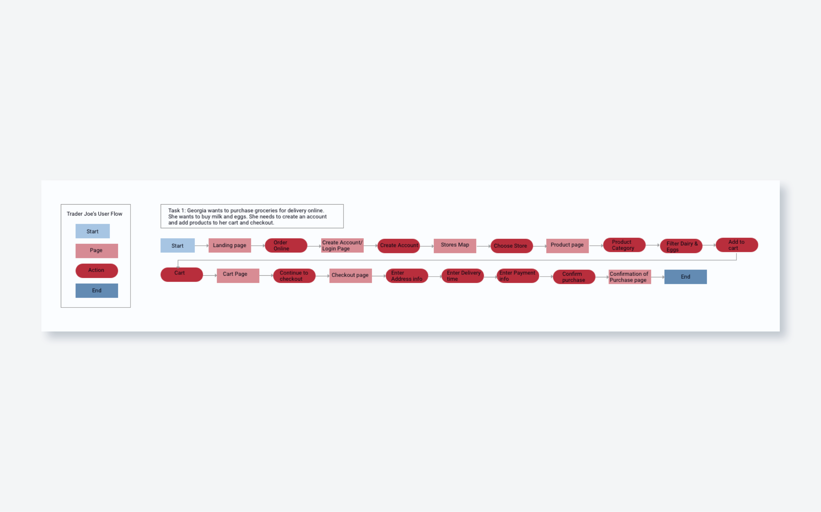
Task Flow
I created a task flow to show a single task of how a user could move through the website. I listed all the pages and steps the user will go through to order groceries for delivery online. I kept in mind user goals and frustrations and tried to make the process as simple as possible by adding filters and categories.
This task flow identifies all the key pages that will be designed in the next steps.
Task Flow
Key Takeaways
During the define phase, I used the insights found in the research phase to design the sitemap. This helped me prioritize and list the categories on the site in a way that would make sense for the users. Then, I was able to create a task flow of ordering groceries online for delivery. This assisted in prioritizing which pages needed to be designed.
3. Design
After the define phase, I integrated my findings and designed wireframes based on the task flow.
Wireframes
Before sketching, I researched common UI design patterns and Trader Joe's competitors to find inspiration and see how they were able to solve user problems. After making a compilation of design solutions, I sketched ideas of wireframes then created mid-fidelity wireframes.
Since the target user is interested in new products and recipes, I began designing the landing page by advertising those products. This allows customers to get ideas of what to buy before shopping. There would also be a banner advertising their grocery delivery service with a CTA to order groceries online.
Then, I sketched different versions of the rest of the flow to let out all my ideas and find the best solution for the user.
Sketched Wireframes
Preview of Mid-Fidelity Wireframes
Key Takeaways
During the design phase, I started by sketching each page of the task flow. I sketched many different designs to let out all my ideas and ensure the best result. Then, I designed mid-fidelity wireframes that would be used to develop the prototype for testing. After getting feedback, I uncovered some pain points users had. I was able to reduce the amount of steps the user took when going through the flow to enhance the user experience.
4. Test
Prototype
After designing the wireframes, I used InVision to develop the prototype for testing.
I interviewed 4 participants who fit Trader Joes' target audience to find insights and pain points to improve the usability of the design.
During the usability test, I asked the users to order milk and eggs online for delivery. I noticed many participants weren't able to see the main CTA and were using the main navigation. This made it difficult to find out if users would have chosen the main CTA rather than the main navigation.
Insights:
The users went through the prototype with little to no errors
Most participants couldn't easily read the CTA and didn't know where to start shopping
Most participants used the filters with little complications
The users went through the checkout process efficiently
Next Steps:
Redesign the CTA and enhance the information architecture in the navigation
Finish designing the rest of the pages to reflect the task flow
User's may not want to login immediately before shopping, move the the flow around
To reduce the steps, create a geolocation so users don't have to find the closest store
Affinity Map
I created an affinity map to sort, prioritize, and rank user testing feedback and list the potential solutions and next steps. I used these insights to update and enhance my designs usability.
Affinity Map
Final Responsive UI Design
I incorporated all my research and design to create the final UI design. I used Trader Joe's brand colors, imagery, typography, and product content to finish the final details of the design.
Creating a responsive design was crucial for Trader Joe's because their target audience uses their phone for almost everything. I wanted the design to be consistent and easily accessible for users. I made the input boxes and buttons larger, while keeping the rest of the design the same.
After testing the design, I used my findings to improve the designs usability. Then, I updated the prototype for further testing.
Preview of the UI
Responsive UI Tablet (left) Mobile (right)
Key Takeaways
During the testing phase, I was able to test the design for its usability. The tests allowed me to watch the user go through the design flow to find any errors that were made that could be fixed. I created an affinity map, based on the feedback I received from the usability tests. Then, I prioritized any pain points the users had and listed the next steps to further improve the design.
Throughout the Trader Joes case study, I did extensive research to effectively implement the pickup/delivery feature. As of now, Trader Joes uses their website to showcase some of their many products, but does not give users many options to find what they are looking for efficiently. I was able to showcase how the company could use their website to gain a larger market share through advertising their products and selling directly online. This would allow them to increase sales and customer loyalty by not only using the website to order online, but also to view all of their products and recommended recipes. The challenge I faced during this project was having to adhere to the Trader Joes UI Kit. I had to find the typefaces and and color palette that they use for their website and always keep them in mind when designing. I really enjoyed redesigning and adding a feature to the Trader Joes website because I appreciate the company and their values.